The essential answer
An accessible practice website helps more people find care and act independently. Accessibility is a design and testing discipline, not a plug-in or a single compliance badge.
Key takeaways
- 01Distinguish Title III private businesses from Title II state/local government regulations.
- 02Use WCAG 2.2 AA as a rigorous design-and-testing reference without claiming it is a universal legal safe harbor.
- 03Test with keyboard and assistive technology, not automated scans alone.
- 04Audit booking tools and downloadable forms as part of the patient journey.
SECTION 01
ADA and WCAG answer different questions
The Americans with Disabilities Act governs access in settings including businesses open to the public. The U.S. Department of Justice provides guidance on web accessibility for businesses and state/local governments. The 2024 Title II web rule contains specific requirements for covered government entities; it should not be casually represented as the same deadline imposed on every private dental office or clinic.
WCAG 2.2 is a technical web accessibility standard developed by W3C. It describes measurable success criteria across perceivable, operable, understandable and robust content. Teams can use WCAG 2.2 Level AA as a practical quality target while separately evaluating applicable legal obligations.
SECTION 03
Form errors should help, not punish
Accessible forms label each field, explain required formats, associate errors with the field and announce changes where needed. Placeholder text is not a sufficient label. Avoid unexpectedly resetting a patient’s input when a validation issue appears.
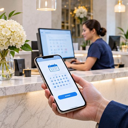
An appointment interface should make it clear whether a request has been sent or a time is actually reserved. The organization must test embedded vendor experiences too. Do not assume an iframe is accessible simply because the host page passes a scanner.
- Persistent field labels and clear required/optional states
- Errors describe how to correct the problem
- Success confirmation is explicit and readable
- Time limits and session expiration are understandable
- Accessible alternatives to CAPTCHA when possible
SECTION 04
Readable information is a clinical communication issue
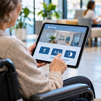
Patients may visit from small phones in bright light, with low vision, cognitive disabilities or temporary impairments. Write concise headings, use comfortable line heights, avoid text placed over busy photography, and maintain adequate contrast. Do not encode critical differences through color alone.
Design for 200% zoom and narrow screens without clipped content. Use descriptive link text—“Download new patient forms (PDF)” is clearer than “Click here.” Identify document types and sizes when useful. Provide meaningful alternatives to instructional images, captions for relevant video, and readable accessible PDFs.
SECTION 05
Use a layered testing method
Automated tools catch many deterministic problems, such as missing labels or some color contrast issues; they cannot reliably determine whether a service description makes sense or a booking journey is navigable for a real user. Combine static scans with manual keyboard tests, assistive technology and users with disabilities when feasible.
Establish a recurring maintenance owner because adding a third-party booking widget, holiday banner or new PDF can introduce problems after a successful launch.
Field checklist
- Automated scan completed and issues triaged
- Keyboard-only booking journey tested
- Screen-reader labels audited on critical pages
- Zoom/reflow checked at mobile widths
- Caption and PDF accessibility reviewed
- Post-launch maintenance owner named
SECTION 06
Publish an accessibility contact route that works
An accessibility statement should tell visitors how to report a barrier and request assistance using a usable channel. It should accurately describe the organization’s process rather than claiming universal perfection. Staff need a response path, not just a public-facing paragraph.
Keep a log of accessibility issues and resolutions. When prioritizing, focus first on being able to contact the practice, locate essential information and request or manage appointments.
Sources & further reading
External sources support the attributed statements above. Links may change; always check their current wording and effective date.